Here are two examples of Art Nouveau typeface. These fonts are heavy typography and are intended to grab the viewers attention for a title and would need to be paired with a more basic text to convey information.
Art Nouveau was a design style applied to art, architecture and the decorative arts. It was created and used primarily from 1890-1910. It was inspired by using nature in the design conception, such as the use of curved lines from flowers and plants. It was considered to be an all encompassing style with it's own philosophy that art should be a way of life.
This type face appeals to me for all of these reasons, as my work is often nature or landscape oriented and historically based.
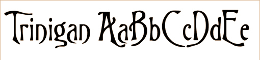
This font is called Trinigan and it is one I have used for a previous gallery show as it fit the theme of the art work.
It is mostly a sans-serif font although on some of the capital letters, like as seen on this "A" you can see the serifs. I love the decorative elements of this font and it allowed great flexibility in my typography.
It is mostly a sans-serif font although on some of the capital letters, like as seen on this "A" you can see the serifs. I love the decorative elements of this font and it allowed great flexibility in my typography.
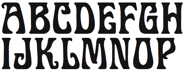
This font is called Gallo and it is a tyepface that has serifs. I personally prefer serifs as I think it is more readable not only in print but also on the internet, contrary to what it says in the text although this font quickly encounters legibility issues in general. This font features a thicker weight than the previous one and stands out stronger than the other font.
 RSS Feed
