12/1: Survey
What was your favorite part or software program of this class?
My favorite part was the Video project and being able to use programs like Premiere which are outside the usual photoshop spectrum. I also liked the PowerPoints on the different sections that we covered which introduced a lot of different artists.
What was your least favorite part or software program of this class?
My least favorite part was trying to navigate the class website. It seemed cluttered and hard to navigate.
What part or program of this class will you continue to use in your artwork?
I am hoping to expand into video. I work with still photography a lot and video is a whole different spectrum that I find interesting.
What was your favorite piece of artwork you made in this class?
I'm proud of my logo and photoshop projects, I felt most inspired with those.
What was your favorite piece of artwork made by someone else in the class?
Christina and Sean's animation project were really inspiring and fun to watch.
If you could change a part of the project assignments or part of this class what would it be?
I would add extra exercises to more complicated programs such as premiere and Photoshop because some people don't have a lot of experience with it. Maybe have extra assignments as extra credit.
12/1: Artist Review: Jonathon Howard
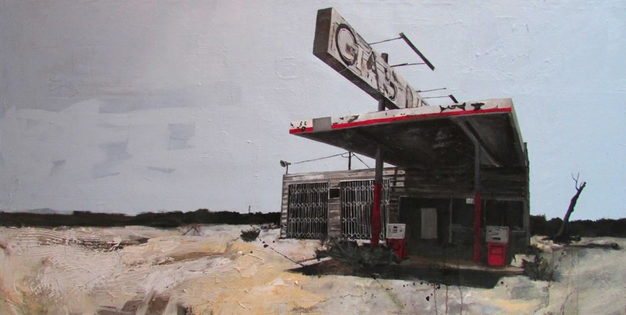
Jonathon Howard's exhibition "Lost in Transition" explores the concept of people being "influenced by memories or mental pre-dispositions to the extent that no single event exists completely in and of itself" (from Howard's artist statement). The exhibition was presented at Modified Arts in Phoenix, where his previous exhibition "Temporal" had also been shown. Howard graduated from Arizona State University in 1997 with a BFA in Painting and has since been shown in various galleries throughout the state with a current rotating show at the Lanning Gallery in Sedona.
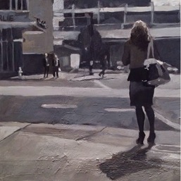
The exhibition had three main sections - pencil and paper illustrations, large landscape-eqsue paintings, and smaller paintings, some presented in triptychs. The set up of the show flowed very well and all three sections tied in with each other. The drawn illustrations were presented on simple white walls and explored random cityscape settings, with people walking along sidewalks and anonymous buildings in the background. His drawings are light and sparse with no impending shading that allow the viewer to fill in the blank spaces with their own realities.
In contrast to his drawings, his monumental paintings take the viewers down the less traveled road. The landscape is flat and bleak with overgrowth that is familiar around small Northern Arizonan towns. The buildings are presented to the left or right of the painting, easy to catch a glimpse of and soon to slide out of view. He explores the decaying beauty of lost buildings through the use of layering newsprint, salt wrappers, and tape mixed with the paint of the canvas. He sticks with a color theme in each painting - steel gray, yellow, and red - and his brushwork is both precise and fleeting to give a balance of abstraction and detail.
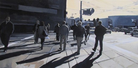
His smaller paintings were of urban landscapes and filled with people frozen in a moment of heading to various destinations. He uses a mainly monochromatic color scheme with hints of steely blues and tans. These paintings captured the moments of people being preoccupied with the bustle of life and going on to the next event of their calendars without notice to the present moment. Howard's own artist statement explains his exploration of how time and reality exist in duality for each individual person.
Howard's exploration of how time's existence is different in each setting and to each individual was very successful. He skillfully creates a balance between realism and abstraction with his individualized style of brushstrokes and incorporation of mixed media. Instead of relying on color to portray a message, Howard allows the viewer to penetrate deeper into the images with the bleakness of his color scheme. The anonymity of his buildings and people are reminiscent of random memories that allow the viewer to fill in with their own story based on the setting he provides.
11/24: Premiere Pro Tutorial
http://layersmagazine.com/color-correction-in-premiere-pro-cs6.html
This is a color correction tutorial from Layers Magazine and I thought it was really in depth and showed how it edit the colors in videos really nicely. Knowing how to add different depths and change colors are very beneficial to any project because color can alter mood in many ways.
http://layersmagazine.com/premiere-pro-frame-holds-and-clip-speed.html
I also chose a tutorial on how edit clip speeds and duration as well as holding different frames. The result was very nice and smooth and would be very useful in slow motion videos.
The website had a wide array of tutorials for all Adobe programs and the ones for premiere were very helpful and unique.
11/10 - Art Reviews
http://scaddistrict.com/the-power-of-a-muse-introducing-charmaine-olivia/
http://artreview.com/reviews/october_2014_mood_is_made_1/
The first review I read was about Muses by Charmaine Olivia, a San Francisco based painter. I've been a long time admirer of Charmaine and I wanted to include this review because the writer does a fantastic job of delving into the themes of the show and how the paintings affect her personally. I like her writing style because not only does she examine the skill and technique of the artist, she also shares the emotions she felt as a viewer. I think that by adding personal details to the review allowed for the readers to have a better sense of the show. The second review I included was about Mood is Made / Temperature is Taken in Glasgow Sculpture Studios. My favorite art medium is sculpture and I was excited to read a review about the exhibit. However, this review was very disappointing. The reviewer seemed to have a high and mighty tonality to her writing, even before she started to describe the show. While I am fully for expressing if you like or dislike something, the reviewer made sure to use the entire expanse of her art vocabulary to describe the show and it was hard for me to the article, even though it was just a few paragraphs. I am more drawn to reviews where a personal component is delivered along with an examination of the artistic skill. The second reviewer expressed her dislike of the show, but left out why she personally wasn't fond of it. I feel like the first reviewer really experienced the art she reviewed while the second one simply wanted to show off her knowledge of artistic lingo.
10/6 - Exhibit
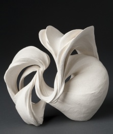
The Resonance of Clay - Phoenix Art Museum
The Phoenix Art Museum is exhibiting a collection of contemporary Japanese ceramics. Japanese ceramicists focus on two different aspects of the art - artistic and practical. The practical aspect focuses on producing items for everyday life such as dish ware and cookware, whereas the artistic aspect is for aesthetic reasons.
The collection exhibits female artists, which is unique because women were allowed to be formally trained in ceramics. Their art tends to be more sculptural and abstract, as opposed to their male counterparts which tend to be more rigid and traditional because they could participate in apprenticeships and were taught from an old culture that focuses on tradition.
I think this exhibition is worth seeing because ceramics tend to be an overlooked aspect of the art world, especially in museums. I also think that viewing pieces that differ from traditional Japanese ceramics allows the viewers to see the art in a new light.
9/29 - Animation
The Unseen Sea from Simon Christen on Vimeo.
The Unseen Sea - Simon Christen
These are various time lapses that Simon Christen created over the course of a year around San Francisco. I love the overall feeling of the time lapses, especially the ones of the fog because it creates such a serene and strange motion. I've spent a lot of time in the Bay area and this captures how captivating the landscape and city can be.
These are various time lapses that Simon Christen created over the course of a year around San Francisco. I love the overall feeling of the time lapses, especially the ones of the fog because it creates such a serene and strange motion. I've spent a lot of time in the Bay area and this captures how captivating the landscape and city can be.
Movie trailer for "9"
The movie "9" is one of my favorite animated films. The story is about a hand stitched doll that wakes up to find himself in a post-apocolyptic, machine-run world where he must try to find some trace of mankind. The plot is very dark and adult but has a very uplifting tone to it as well. This is mimicked in the beautiful and immaculate detail of the animation. The dolls are set to look hand stitched and rough, but they have very kind and humanistic features to them.
The movie "9" is one of my favorite animated films. The story is about a hand stitched doll that wakes up to find himself in a post-apocolyptic, machine-run world where he must try to find some trace of mankind. The plot is very dark and adult but has a very uplifting tone to it as well. This is mimicked in the beautiful and immaculate detail of the animation. The dolls are set to look hand stitched and rough, but they have very kind and humanistic features to them.
9/8 - Blog #1: Typography
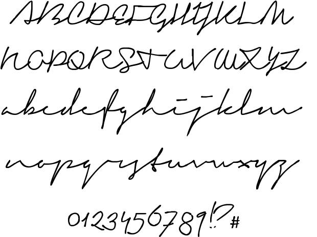
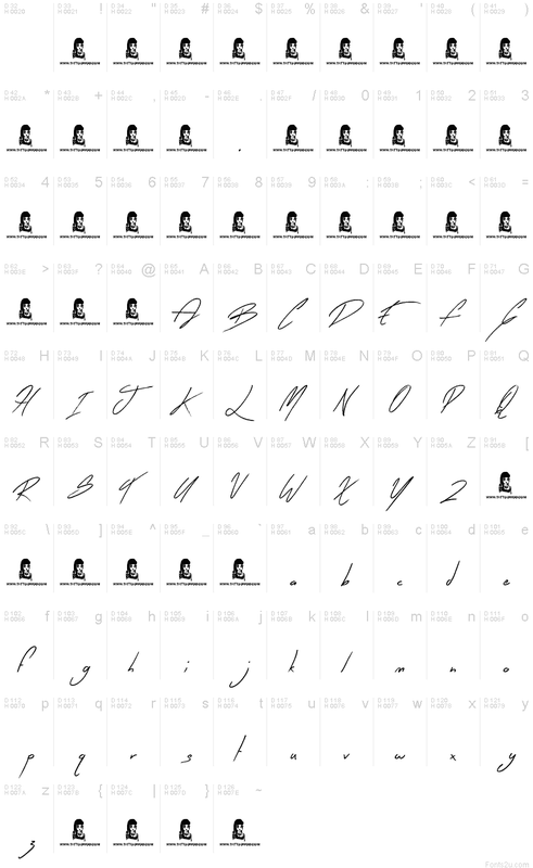
I have always been a fan of typography and the way that fonts can evoke different feelings and tones simply by the way a word or phrase is presented in an artistic form. I am drawn towards fonts that look handwritten or curvy because it's very aesthetically pleasing and draws away from the standard typeface of straight, sans-serif lettering that we are faced with every day in forms of logos, street signs, and many other things. Texts, news articles, even social media are all presented in the same uniform typeface. It is refreshing to see words presented with a creative element and used to provoke feelings or thoughts. Most of the time when we need to write something it's usually typed on some sort of technology, which is losing the actual written aspect of writing. I like the individuality behind handwritten things and that is why I chose the following fonts.
The first font I chose is from dafont.com and it is called "Signerica". I actually used this font for one of my tattoos and I like it because it's a very smooth and curvy, slightly slanting to the right. I like the thin lettering because it makes the font seem effortless.
The second font I chose is called "Early Bird" and it is also a handwritten font, but it is closer together and has more breaks and harsher edges, as if it was written faster or in a hurry. The contrast in these two fonts alludes to how handwriting can portray different emotions, such as easy going or hurriedness.
