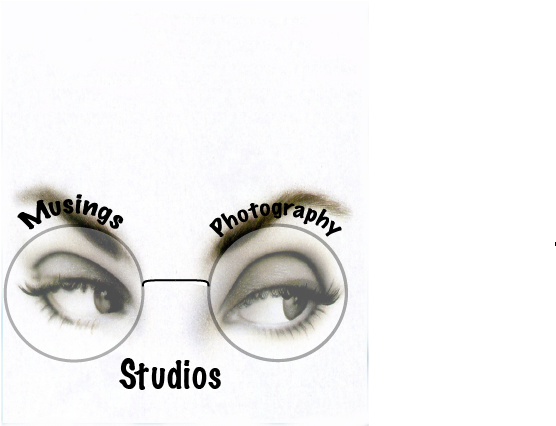
Musings Logo
I got the Idea for the Musings Logo after looking at the cover for the book The Great Gatsby and Dr. Eckelburg. I've read the book constantly since I was 14 yrs old. I like the Idea of a Muse which of course in most stories is female and really the eyes just do it, why because as they say "they are the key to the soul. What inspires most artists, "a muse." The font I ended up using was Marker Formatted font, really because I wanted the name to be simply put and noticeable. The design is fairly simple like the original picture from both movies and the book itself. I like the thickness of the frame because it shows the best over the eyes. I also ended up using a 4Pt line thickness for the frames just so that they could be noticeable same with the nose bridge. Overall I really like the design it's simple and goes with the Musings theme as well as another theme I use when I shoot called "through the looking glass." Its used as a way to see new ideas and designs when i shoot.

