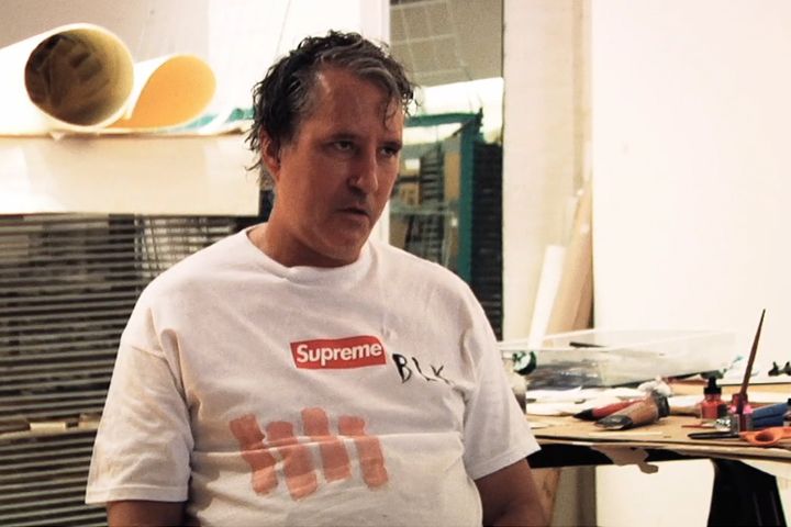
Richard Pettibon is an artist who is a an Arizona Native. He was born in 1957 and raised in Tucson. Strangely enough he went to college and earned a degree in economics and after graduating college he became a high school math teacher. That didn't last for long and he decided to follow his passion, which is art. The following quote is a prelude to a video about Raymond Pettibon. The author is unknown, but it appears on pbs.org/art21/artists/raymond-pettibon as part of a series about artists.
"A cult figure among underground music devotees for his early work associated with the Los Angeles punk rock scene, Pettibon has acquired an international reputation as one of the foremost contemporary American artists working with drawing, text, and artist’s books. Pettibon is as likely to explore the subject of surfing as he is typography; themes from art history and nineteenth-century literature appear in the same breath as 1960s American politics and contemporary pop culture."
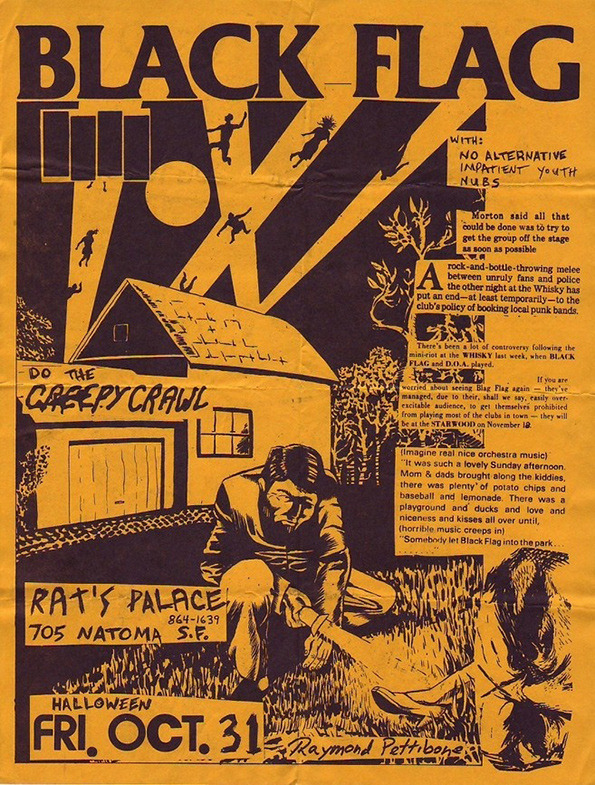
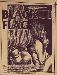
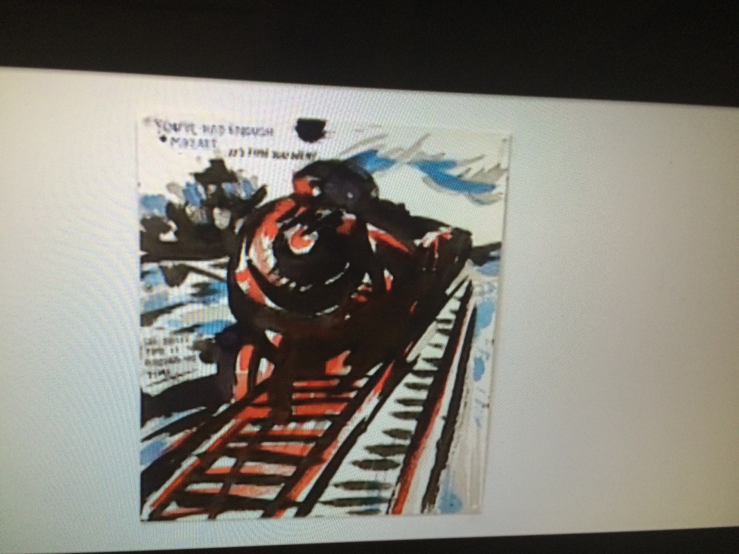
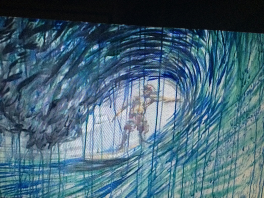
After watching the video of Mr. Pettibon I realized this is a man who lives in his art and it shows in his work. I think some of his best work is actually working with typography back in the 70's and 80's. More recently it seems he is doing more painting than anything. He likes to paint scenes of surfing, trains(going west) and baseball(good days-larger than life) to name a few. In the past he's done a lot of work in satire poking fun at politicians and anyone who rubs him the wrong way.
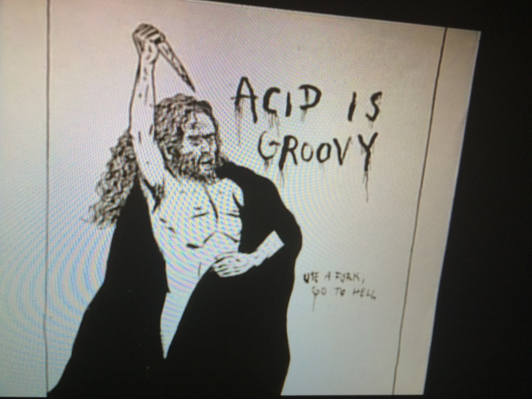
Pettibon is also known for his dark images, which depict violence and or sexually explicit subject matter and he is not constrained with any topic because he believes his work can address issues in society. He also feels his work can represent an alternate universe, can be therapeutic and in the end art represents a microcosm.
"A cult figure among underground music devotees for his early work associated with the Los Angeles punk rock scene, Pettibon has acquired an international reputation as one of the foremost contemporary American artists working with drawing, text, and artist’s books. Pettibon is as likely to explore the subject of surfing as he is typography; themes from art history and nineteenth-century literature appear in the same breath as 1960s American politics and contemporary pop culture."
After watching the video of Mr. Pettibon I realized this is a man who lives in his art and it shows in his work. I think some of his best work is actually working with typography back in the 70's and 80's. More recently it seems he is doing more painting than anything. He likes to paint scenes of surfing, trains(going west) and baseball(good days-larger than life) to name a few. In the past he's done a lot of work in satire poking fun at politicians and anyone who rubs him the wrong way.
Pettibon is also known for his dark images, which depict violence and or sexually explicit subject matter and he is not constrained with any topic because he believes his work can address issues in society. He also feels his work can represent an alternate universe, can be therapeutic and in the end art represents a microcosm.
