ART 116   Intro to Digital Media Fall 2014
  • HOME/SCHEDULE... please don't click delete
  • Students
    • Briana Lin
    • Dalton Radcliffe
    • Debora Campos Motta
    • Derek Phillips
    • Julia Lesniak
    • Kristina Garcia
    • Kyle Dickey
    • Marlena Milum >
      • Marlena's video ex.
      • Marlena's Final
    • Peter Talavera
    • Rachel Heitz
    • Sean Sheridan
    • Sydney Irwin
  • Blog
    • Blog Prompts
  • Units and Assignments
    • Class Website
    • Vector Unit
    • Raster/ Photoshop Unit
    • Animation
    • Sound Unit
    • Video Unit
  • Information / Hand Outs
    • Artist Statment Critque Explination
    • Herburger Institute: Undergraduate Survey
  • oppurtunities
  • Contact
  • Untitled

class Survey

12/1/2014

0 Comments

 
What was your favorite part or software program of this class?
- My favorite part about this class has got to be the variety of things we get to do. Granted, it is all digital media, but the range of different projects we got to do was very cool and very enjoyable.
What was your least favorite part or software program of this class?
- Least favorite part is hard. If I had to choose one thing, it would be not doing enough reading out of the textbook that was applicable. In a way, it was, but I feel like we should have done more possibly. As long as it was related to what we were learning then it would be completely fine and justified. 
What part or program of this class will you continue to use in your artwork?
- I will continue to use probably all the programs we have used in future art. I believe Photoshop and Premiere are going to be the top 2 that I use the most in the future. But I am sure to use all the skills and knowledge I have learned.
What was your favorite piece of artwork you made in this class?
- My favorite piece of artwork I made in class has got to be my logo. 
What was your favorite piece of artwork made by someone else in the class?
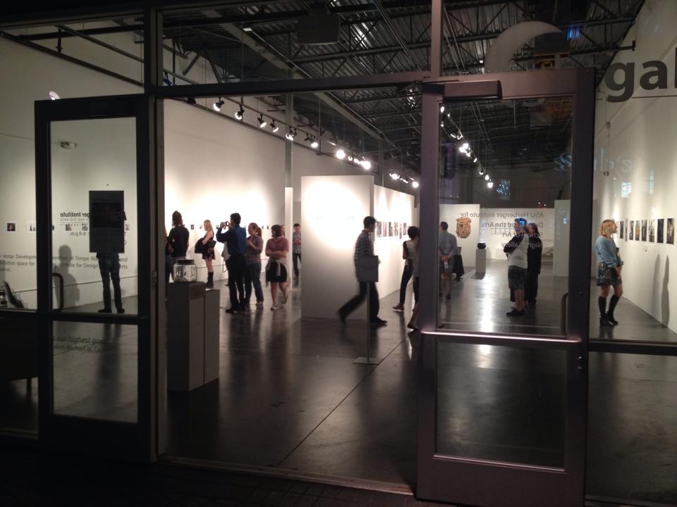
- My  favorite piece of artwork made by someone else in the class will have to be Dalton's time lapse or Sydney's animation.
0 Comments

Blog Post #10: art review

12/1/2014

0 Comments

 
Picture
I went to the Night Gallery at Tempe Marketplace on November 27. The current exhibition is called Living Spaces featuring work by Meghan Kesti, Sirrena Griego, Josh Loeser, and Megan Richmond.  The exhibit featured photography as well as wooden sculptures and an (almost) interactive piece as well. 

Being at the Night Gallery, I feel like it attracts lots of passerbyers in a sense that people will just browse and not really look. In a way, it's good because it attracts a big audience because of it's location. Overall, I really liked the way they laid it out. When you first walk in there are the photographs on the walls. Nice portraits and I really did enjoy the photos and they stopped me from walking which is always a good sign. Walking towards the back you approach the few wooden sculptures. 

In my opinion, they were brilliant. Mixing medias and showcasing them together was very interesting and seems so normal but for some reason really stood out to me this time. Combining the photographs and the wooden sculptures was clever even though they were not too closely related. A particular, disorganized yet brilliant wooden sculpture piece gave me flashbacks of my childhood. The very strategically planned chaos of a piece really drew me in and had me analyzing every nook and cranny of the piece. It really reminded me of being a child and building things out of scraps that I found. The piece overall gave me joy as I remembered the innocence and carefree lifestyle of being a child. 


I liked the concept of the portrait photographs. Each seemed to tell a story yet they all seemed a part of the same story. I feel like I took away more because I myself am a photographer. However, it was a nice collection of beautifully arranged photographs. And as for the concept of the wooden sculptures, I really enjoyed the organic or geometric shapes each piece had. And the interactive piece was very stunning as well. It has a little storyboard cartoon of what it was and an actual built representative of what is happening in the cartoon. I really liked that concept of building something and showing what you imagined in your head.

Even with a short visit, I took away so much from this exhibit. I really enjoyed everything about it, as I have always loved the Night Gallery concept. I think the person there could have been more friendly and informative, but other than that it was great. And kind of nice being left completely alone to analyze the artwork without a word being said inbetween. I would recommend this show to anyone who is interested in sculptures or photography. Unfortunately, the exhibit ended on November 29, but if you have not been to the Night Gallery, I highly recommend going sometime!
0 Comments

Blog Post #9: Adobe Premiere Tutorial

11/23/2014

0 Comments

 
I really like this beginner tutorial for a few reasons. It goes through all the basic information you need to know as well as some shortcuts. I learned a lot of different shortcuts through this video that are going to be extra helpful in the future. Also it was easy to follow and clean examples.
0 Comments

Blog post #8: Art Video

11/17/2014

0 Comments


Without You

This is a music video by Lapalux. I had to watch it a couple times before I could fully understand and appreciate what I was watching. It has a story and I really like it for some reason. It's weird but it strangely makes sense to me. I feel like there is always more to it than it seems, and everyone can take away something from it. I also love the way it was filmed, I find it very beautiful. Watch it a few times, and hopefully you can take away something from it and enjoy it as much as I do.
0 Comments

Blog Post #6: Sound Art

10/22/2014

0 Comments

 
Two pieces of sound based art that I found were:

0 Comments

Blog Post #5: gallery Visit

10/1/2014

0 Comments

 
One gallery I'd really like to visit would be the Night Gallery at Tempe Marketplace. I have been to the gallery before a few years back and it was such a positive experience I'd love to go back. 

I like the fact that this takes place in a crowded area at night. It adds to the "night life" atmosphere. I think people should go check it out because it's quite a different experience when you look at art at night. And I believe it's one everyone should experience! Check it out!

Hours: Tuesday–Sunday, 6–9 p.m


0 Comments

Blog post #4: animation

9/24/2014

0 Comments


A Time Lapse Collection from Simon Christen on Vimeo.

I like this one because it shows the beauty of time and different places. It makes me appreciate the beauty in the little things in life combining natural beauty and industrial beauty.

the Blank Page from George Metaxas on Vimeo.

This was just a cute little stop motion animation I found. The story is interesting and totally up for interpretation which is one of the main reasons I love it so much.
0 Comments

Blog Post #3: Discovering New ArtistsĀ 

9/22/2014

0 Comments

 
The artist I discovered from Art21 was Robert Adams.

Robert Adams is a black and white photographer who focuses the majority of his works on the American West and the changes that have been happening over the years. His work is phenomenal and breathtaking. The fact that he uses black and white to strip away the distraction of color adds something special to all his pieces. To me they look so real, even for it being in black and white. 

Something he mentioned in the video was that he said the key to photography is to showcase something that always suggests more than it shows. Also he mentioned a lot about how he wants to depict the American West, by showing the glory of it but also what is disturbing and needs correction. He talks a lot about light and capturing the perfect combination of truth and what needs to be fixed in each shot. I really enjoyed the way he speaks about photos and the way of capturing landscapes. He is truly an amazing artist that I look up to.
Picture
Picture
0 Comments

Blog Post #1: Vector & Font

9/8/2014

0 Comments

 
Here are two fonts that I really like from dafont.com.

The first one is called Hipsterish; I like this one for a few different reasons. The height between the meanline and the baseline is larger than normal giving it an extended look. This also means the ascender is shorter and that's something that I like as well. I also like that it's a sans serif font. It's clean cut, and the kerning between letters are a little more prominent than in other fonts.

Picture
The second one is called Ahellya; it is a serif font. The weight is different than your typical Times New Roman font and I prefer lighter weighted fonts over heavier ones. The kerning between letters are a little greater than that in Times New Roman but not quite as much as my previous font that I picked. The ascender and descender of the font is longer than normal giving it also an extended look. 
Picture
Overall, I like both serif and sans serif fonts. Both have similar qualities but are obviously different. I couldn't pick a favorite unless I knew what it was being used for.
0 Comments

    RSS Feed

Powered by Create your own unique website with customizable templates.