Here are two fonts that I really like from dafont.com.
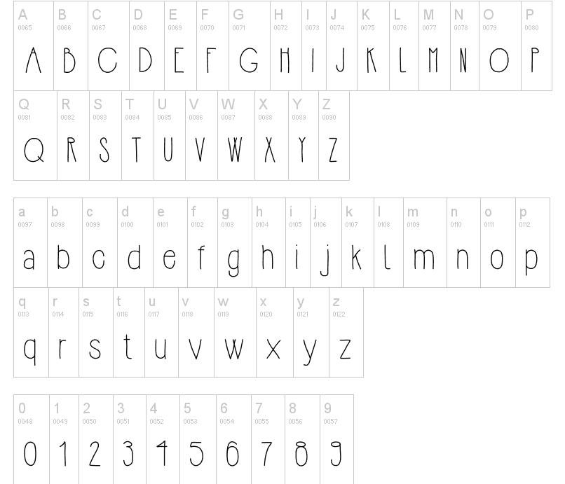
The first one is called Hipsterish; I like this one for a few different reasons. The height between the meanline and the baseline is larger than normal giving it an extended look. This also means the ascender is shorter and that's something that I like as well. I also like that it's a sans serif font. It's clean cut, and the kerning between letters are a little more prominent than in other fonts.
The first one is called Hipsterish; I like this one for a few different reasons. The height between the meanline and the baseline is larger than normal giving it an extended look. This also means the ascender is shorter and that's something that I like as well. I also like that it's a sans serif font. It's clean cut, and the kerning between letters are a little more prominent than in other fonts.
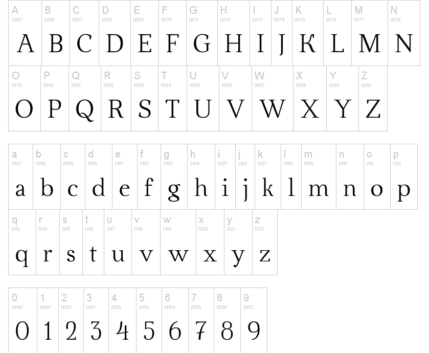
The second one is called Ahellya; it is a serif font. The weight is different than your typical Times New Roman font and I prefer lighter weighted fonts over heavier ones. The kerning between letters are a little greater than that in Times New Roman but not quite as much as my previous font that I picked. The ascender and descender of the font is longer than normal giving it also an extended look.
Overall, I like both serif and sans serif fonts. Both have similar qualities but are obviously different. I couldn't pick a favorite unless I knew what it was being used for.
 RSS Feed
