[Above is Kenyan Coffee]
[Below is Droidiga]
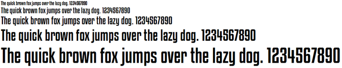
[Below is Droidiga]

I haven't been one for messing with fonts too much in my works. When I do however need to find a new font or just something different that what some computers have, I go to dafont.com. It seems to have something there for me when I am in search of a new font. Based off my previous statements, because I don't have a huge desire to find some crazy fonts, I am more of a simplistic guy in all of my work and life. I like to keep things in my life 'clean and simple' so I have always been drawn towards san serif fonts because serifs are easier to read for long lines of text, I don't find interest in those because I am never writing blocks of text to be published.
The two typefaces that caught my attention on dafont.com were Kenyan Coffee and Droidiga. Both of these typefaces have a heavy weighting. It also happens to be that they both don't have a huge gap between their meanline and cap height. The reason I point these two things out is because as I said before, I like 'clean and simple.' Since the weight is heavy, it doesn't allow for a lot of little serifs here and there and that is why I like these typefaces: the characteristics of each letter that distinguish from the others is all there is present in Kenyan Coffee and Droidiga. Both typefaces are quite basic in nature. Droidiga does have a slightly looser tracking than Kenyan Coffee, but Kenyan Coffee's tracking isn't so much closer that it is obnoxious to read.
Though Droidiga has a few strange letters in its typeface, I still don't think the oddity of them takes away from being clean and simple. It appears to still use straight lines to just add to the essence of that letter to give it a different 'feel' if you will. This does limit this font to some specific uses however.
 RSS Feed
