|
The first artist that I chose for this BLOG are Martin Arnold. He is an artist from Vienna who likes to use old film footage and rework them in well "here comes the remix" like fashion. I like the way he replays some of the videos they can be weird and some what creepy. the video I chose is called Passage a L' acts. It is old reused footage from the movie To Kill a Mocking Bird. In a way it is very minimalistic and repeats patterns.
https://www.youtube.com/watch?v=0jJtSv-o-m4 The last artist I chose is Skip Blumberg he used a camcorder to capture images and did a lot of work for TV broad cast this way. His early work reflects a medium specific format. The piece I chose is called JGLING and is a video featuring juggling virtuoso Mario Drougett. The piece is housed permanently at Modern Art Museum at Hofstra University. https://www.youtube.com/watch?v=87UUr1WXt58 Marco Rios: ‘"S” Is for Sincere, Formerly Formally “F” Is for Fake’
New York Times Simon Preston The first review was about the work of Marco Rios and his adaption of works and drawings that he had done in his childhood through paintings projected. Personally I thought the review was pretty well written and gave a good summary of the art and artist, what he did for this particular show and how the art was received. He was a tiny bit vague as some parts, but overall it was well written. A Gallery Show, Site Unseen At Marina Abramovic’s ‘Generator, 'Blindfolds Are Required Ken Johnson New York Times The second review by Ken Johnson was a little more detailed than the first. I do think Mr. Johnson had to be a little more descriptive of the art that is being performed since it sort of questionable art. "Generator" as is it called is the art of sensory deprivation. Mr. Johson talks about walking around for about an hour with a blindfold and ear phones on eventually creating his own art. I liked the article is gave an opinion about the work and a great description of the reviewers feelings and what he went through experiencing the work since it is interactive. I don’t know that it can be considered art but it let the viewer interact in a very different way and create art in their minds which is unique. The first Artists is Pierre Bastien, the piece is called Mechanologie. He is a french based sound artist who worked with mechanical tools to create his sounds. This is something that is cool and unique to me since I totally dig nerdy mechanical noises that actually are on beat with a metronome. It was very cool I also like the use of household objects to make the sounds a very unique way to make a great number of sounds and beats. Harry BertoiaHarry Berotia was actually a jewelry designer and sound artists and sculpture. I really just like this work because of how soothing the sounds of the instruments hat he uses are. The are actually melodic a little chaotic at times but still crazy but restful and they give a sense of space and the space the artist is working in with the echoes that reverberate.
I like the style of the animation in South park because of its simplicity and reflections of the creators personality. There is a sarcastic sense to each creation.
Stope Motion animation such at Tim Burtons The Nightmare Before Christmas is one of my personal favorites. I live the attention to detail and each character. 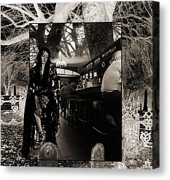

After looking around for an artist that uses digital media to "trick the eye into believing" I fell upon the work of James G. Respess. His story is fairly interesting he is a jack of all trades from Pacific Beach, California. A PhD in Molecular Biology with a huge interest in the arts as well during his earlier years. in 1996 Respess became a full time digital artist. His subject matter is historic California settings, but what I like is he has a way of completely fooling the eye. Long Black Veil is fairly obvious in that took two different photographs of the same woman in a cemetery with different filtering through photoshop and laid a photo of a bar scene with her sitting on a bar stool behind the scene almost framed. Pretty sure he was listening to Johnny Cash's Long Black Veil when he did this, it's about a married woman that goes to visit her lovers grave. I like the fact that this photo fools the mind into thinking it's shot on one or two angles when if you look closely there are probably 4-5 shots that comprise it. With the second photo that has been digital enhances Spirits in the sunset. If you look closely you can see the outlines of the spirits when you look into the sunset. This photo really tricks the viewer into having to look for the illusion that he has created. If I hadn't read the title of the piece i would never have paid attention to the outlines in the sunset. Respess has succeeded in not really fooling the viewer, but more making them work to see the imagery he has laid out in his work. There is a lot to his design elements and I think those are the things that can be pointed out to the viewer.
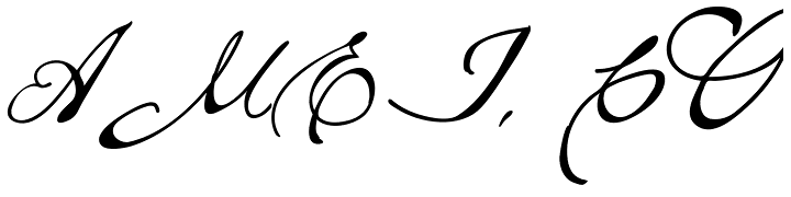 Brew Script Regular: The specific font appealed to me. The current name for my photography business is Musings Photography a muse is mysterious and of course inspires. I like the typeset itself and the spacing and curves. It can be hard to read but gives off the mysterious look. 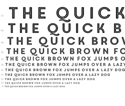 Core Circus 2D:
The second font that I took a look at is called Core Circus 2D. This specific font appealed to me just due to the fact that it has a little bit of a retro 1920s style. The typeset itself is very readable yet has character and matches a theme. I looked at the text size in 12 point font and it is still fairly readable. The tone of the text lends itself to many different colors with exception to the red, yellows and oranges that are not normally acceptable in most professional forums. |
 RSS Feed
