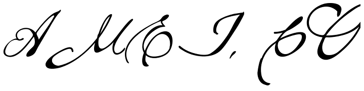
Brew Script Regular:
The specific font appealed to me. The current name for my photography business is Musings Photography a muse is mysterious and of course inspires. I like the typeset itself and the spacing and curves. It can be hard to read but gives off the mysterious look.
The specific font appealed to me. The current name for my photography business is Musings Photography a muse is mysterious and of course inspires. I like the typeset itself and the spacing and curves. It can be hard to read but gives off the mysterious look.
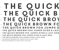
Core Circus 2D:
The second font that I took a look at is called Core Circus 2D. This specific font appealed to me just due to the fact that it has a little bit of a retro 1920s style. The typeset itself is very readable yet has character and matches a theme. I looked at the text size in 12 point font and it is still fairly readable. The tone of the text lends itself to many different colors with exception to the red, yellows and oranges that are not normally acceptable in most professional forums.
The second font that I took a look at is called Core Circus 2D. This specific font appealed to me just due to the fact that it has a little bit of a retro 1920s style. The typeset itself is very readable yet has character and matches a theme. I looked at the text size in 12 point font and it is still fairly readable. The tone of the text lends itself to many different colors with exception to the red, yellows and oranges that are not normally acceptable in most professional forums.
 RSS Feed
