ART 116   Intro to Digital Media Fall 2014
  • HOME/SCHEDULE... please don't click delete
  • Students
    • Briana Lin
    • Dalton Radcliffe
    • Debora Campos Motta
    • Derek Phillips
    • Julia Lesniak
    • Kristina Garcia
    • Kyle Dickey
    • Marlena Milum >
      • Marlena's video ex.
      • Marlena's Final
    • Peter Talavera
    • Rachel Heitz
    • Sean Sheridan
    • Sydney Irwin
  • Blog
    • Blog Prompts
  • Units and Assignments
    • Class Website
    • Vector Unit
    • Raster/ Photoshop Unit
    • Animation
    • Sound Unit
    • Video Unit
  • Information / Hand Outs
    • Artist Statment Critque Explination
    • Herburger Institute: Undergraduate Survey
  • oppurtunities
  • Contact
  • Untitled

Class Survey

11/27/2014

0 Comments

 
What was your favorite part or software program of this class?
My favorite program was learning the basics of Adobe Illustrator. I have never had the opportunity to work with this program before this class and it has helped tremendously. 
What was your least favorite part or software program of this class?
My least favorite part of the class was blogs. I did find them interesting but I think it was a little annoying but I am kind of just trying to something to put here. 
What part or program of this class will you continue to use in your artwork?
I will continue to use Photoshop, Illustrator, Premiere all in my work from here on out. 
What was your favorite piece of artwork you made in this class?
My favorite would be all of them. I was able to create something new and different than before and though I may not always be 100% satisfied with the result, I am happy with it. If I had to pick just one, I would choose my new Illustrator logo. 
What was your favorite piece of artwork made by someone else in the class? 
I really enjoyed Julie's free lens images that were use in her Photoshop exercise. 
If you could change a part of the project assignments or part of this class what would it be?
If I was forced to change one part of the class, I would suggest adding maybe more work for photoshop/illustrator work because I can see those being very helpful in the future world of digital technology. 
0 Comments

Adobe Premiere Lighting Effects

11/23/2014

0 Comments

 
I found this tutorial on adding lighting effects to video clips (still images in the tutorial). This can be extremely helpful when forced to shoot in bad lighting conditions and you need to expose for other aspects of the scene, then you can come back and add some extra light in later, and there are multiple types of additional light. So far, don't have a final video that I want to use but this doesn't necessarily work for the beach scenes I have now, but I know how hard it can be get proper exposures in the dark. 
0 Comments

Art Review

11/19/2014

0 Comments

 
Picture
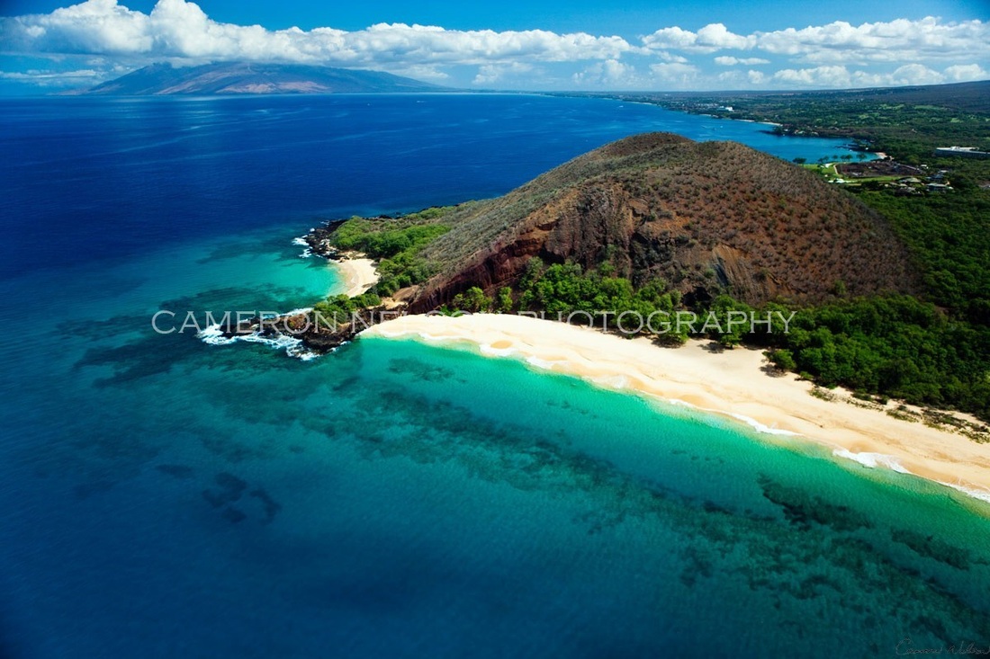
Four Seasons Wailea, Maui, HI - Spending a decade of your career in one of the most beautiful places in the world can result in of the most amazing photos. Hawaii has so much to capture, almost too much to capture in just one life time. Cameron Nelson's galleries of work from his time spent here are breathtaking - finding nature at its finest moments to let everyone enjoy. 

Cameron himself has had an interesting career span that I found out after talking to him about his works. Cameron was first a wedding photographer in Southern California. He worked that angle, along with other portraiture photography for 7 years but could not handle the fast paced, hours of traffic that you get with thirty million people in such a confined area. Cameron decided to leave and headed to South Africa to shoot fashion photography while still being able to follow up on his passion of surfing that he had come to love in Southern California. Cameron eventually met his wife in South Africa and they made the move just over a decade ago to Hawaii to shoot the beautiful landscapes and nature creatures that are so prevalent there. He loved the more relaxed and calming peace that Hawaii can bring to a person and that definitely shows in his works that he displays in his mobile galleries throughout the islands. 

The feeling of being more relaxed when shooting your work gives him the ability to create works of art that make you think: "oh that looks fake!" because it just doesn't seem real to be able to find these perfect locations for the subjects of the photos. Cameron does great work of ensuring the proper color of the locations he visits is perfectly represented in his printed images. Works such as his "Paradise Found _ Maui" have the perfect amount of clarity from front to back, keeping his highlights and shadows in check and the color as exactly as you would see. The work presented in this gallery were all from Hawaii and include a broad range of what is there on the island.  

The compositions of his pieces of art also make for a desire to want more. You might already look through his galleries online and realize that you just cannot get enough. The is the pull Cameron has with his work - already able to capture the images we want and desiring more that we think Hawaii can offer to us. His quality of equipment and huge found knowledge of the art, has allowed him to truly find those special moments we think of when one envisions Hawaii. 


I did have a tendency to get enveloped into Cameron’s work and that is why I enjoyed this gallery set up. It was laid out in a casual format at the hotel, very inviting and flows well to still have a professional feel for a Hawaiian photographer. I was impressed with his exposures and compositions, the foam water images on the beach however did not impress me. They were done technically correct but I found them basic, un-moving.

His mobile gallery set-ups can be found at the Four Seasons' Resort in Wailea on Saturdays from 8:00-1:30 and at the Gran Wailea Resort in Wailea on Wednesdays from 8:00-2:00. You can contact Cameron Nelson Fine Art Photography at 808-974-8183 or order and browse his galleries at www.cameronnelsongallery.com.  


0 Comments

Video Art 

11/19/2014

0 Comments

 
Pipilotti Rist - I Couldn't Agree with You More
1999, Kunsthalle, Zurich

I like this video art because it is such a different perspective than some of the others we have watched. She chose an interesting angle and it works. I also enjoy how she chose to do something that everyone has to do - grocery shopping. It makes it more related able to the viewers to start thinking about how we look at the things we do every single day. She also takes the video camera back to the house with her and finishing the video there but I preferred the scenes in the grocery store. 

Pipilotti Rist - I Couldn't Agree with You More
0 Comments

Art Reviews Blog

11/10/2014

0 Comments

 
The two art reviews I read were about “Hubbard and Birchler” by Gregory Volk talking about old movie sets left over in the Texan landscape and “Kate Ericson and Mel Ziegler” by Aimee Walleston discussing twenty to thirty year old pieces of art about historical places across America, both from Art in America Magazine. I preferred Gregory Volk’s review over Aimee’s because it seemed more about the art pieces and describing them and did hint upon it’s historical factor. Aimee’s seemed to focus too much on the historical features of each art work rather than the description of the pieces and I don’t get a feeling of desire to want to view those pieces as much as I want to see those described by Gregory. 
Hubbard and Birchler
Ericson and Ziegler
0 Comments

Art Gallery Visit

10/1/2014

0 Comments

 
I found an art gallery that is going up in downtown at the Trinity Cathedral for the next couple of weeks. It is called "Beyond the Shiny Metal Object - Reflections on the Shadow's Light". This October event at the cathedral caught my eye because I am interested in how light works because I normal experience light through the lens of a camera and my experience taking night photography. I would love to be able to go and look at art pieces however that will specifically evoke the vision of the viewer specifically. I have had a growing interest in the past few years about working with metal and how it can be formed and I think this is a great event to attend to possibly get some inspiration for work I might want to attempt in the future.

Trinity Cathedral October Art Show
Picture
0 Comments

Animation Ideas

9/24/2014

0 Comments

 
As a photographer, a small bit of my interest also falls in videography, specifically timelapses. Here are a few links to timelases that I hope I can create similarly throughout the night sky.  My overall plan is to make a timelapse that covers parts of Tempe/ASU throughout a day.

Suddenly I Feel Light from Jeff Morris on Vimeo.

Dreamscapes from Jonathan Besler on Vimeo.

0 Comments

Glenn Ligon

9/22/2014

0 Comments

 
I watched the beginning of a PBS video on Glenn Ligon. I thought that he was a very interesting artists and had an interesting beginning. He talked about he wasn't necessarily a free drawer when he was a kid, rather he would copy. By copy, he would take, for example, newspaper cartoon characters and cut them out, draw them for his friends for sale. He knew he wanted to be an artists by high school. His mother was a big help in getting his interested even more peaked by sending him to after school programs at the local museum. Glenn has an interesting beginning in his childhood I think and that is what caught my attention. 

Hearing that some artists weren't that good at just free drawing is what drew me in. I would also see in school plenty of girls for the most part, doodling in notebooks and looking at this drawings and wishing I could do that but I didn't feel I had the creative mindset to make something like that. I would think that most artists had some start like that but to hear how Glenn would just copy other drawings and sell them, just goes to show that no two people are the same in how they get to where they are - everyone has a story that should be heard, you might be surprised at what you find out. 
0 Comments

Raster and Photoshop Lies

9/13/2014

0 Comments

 
https://www.flickr.com/photos/34621468@N00/14501909492/in/pool-13867288@N00

http://www.canadiannaturephotographer.com/hockney.html

I was able to find a few groups on Flickr as well of Hockney style images made in Photoshop. The Flickr artists [Lisa IndigoBurns Wormsley] did a great job with getting a huge range of angles of just someones face to create this huge photo that turns a normal portrait into something way more interesting. 

The Canadian Nature Photographer has multiple personal examples on the website. His very last one, of the waterfall, is one that I think he did a great job representing the Hockney style. He did a good job of moving the individual images close enough together for us to understand the main idea, but also looking at some of the images as individuals, you see some finer detail. Having each image bordered with a white box helps define each part of this Hockney and also makes us look closer at the individual landmarks of this photo: the dead log in bottom left, the rocks in the middle and the surrounding trees. The photo can be broken up but works well together. 
0 Comments

Vector and Font Blog Post

9/2/2014

0 Comments

 
Picture
[Above is Kenyan Coffee]
[Below is Droidiga]
Picture
I haven't been one for messing with fonts too much in my works. When I do however need to find a new font or just something different that what some computers have, I go to dafont.com. It seems to have something there for me when I am in search of a new font. Based off my previous statements, because I don't have a huge desire to find some crazy fonts, I am more of a simplistic guy in all of my work and life. I like to keep things in my life 'clean and simple' so I have always been drawn towards san serif fonts because serifs are easier to read for long lines of text, I don't find interest in those because I am never writing blocks of text to be published. 

The two typefaces that caught my attention on dafont.com were Kenyan Coffee and Droidiga. Both of these typefaces have a heavy weighting.  It also happens to be that they both don't have a huge gap between their meanline and cap height. The reason I point these two things out is because as I said before, I like 'clean and simple.' Since the weight is heavy, it doesn't allow for a lot of little serifs here and there and that is why I like these typefaces: the characteristics of each letter that distinguish from the others is all there is present in Kenyan Coffee and Droidiga. Both typefaces are quite basic in nature. Droidiga does have a slightly looser tracking than Kenyan Coffee, but Kenyan Coffee's tracking isn't so much closer that it is obnoxious to read. 

Though Droidiga has a few strange letters in its typeface, I still don't think the oddity of them takes away from being clean and simple. It appears to still use straight lines to just add to the essence of that letter to give it a different 'feel' if you will. This does limit this font to some specific uses however. 

0 Comments

    Author

    Photography and cars, that's all you need to know..

    Categories

    All

    Archives

    November 2014
    October 2014
    September 2014

    RSS Feed

Powered by Create your own unique website with customizable templates.