ART 116   Intro to Digital Media Fall 2014
  • HOME/SCHEDULE... please don't click delete
  • Students
    • Briana Lin
    • Dalton Radcliffe
    • Debora Campos Motta
    • Derek Phillips
    • Julia Lesniak
    • Kristina Garcia
    • Kyle Dickey
    • Marlena Milum >
      • Marlena's video ex.
      • Marlena's Final
    • Peter Talavera
    • Rachel Heitz
    • Sean Sheridan
    • Sydney Irwin
  • Blog
    • Blog Prompts
  • Units and Assignments
    • Class Website
    • Vector Unit
    • Raster/ Photoshop Unit
    • Animation
    • Sound Unit
    • Video Unit
  • Information / Hand Outs
    • Artist Statment Critque Explination
    • Herburger Institute: Undergraduate Survey
  • oppurtunities
  • Contact
  • Untitled

Animation Videos

9/28/2014

0 Comments

 
I really enjoy this simple animation because you can see the persons hand moving and you can see every step of the animation very clearly yet it adds to the effect of the video. I also like the song and how cute the couple is. 
I think this video is so fun! It's interesting and funny, fast paced and creative. I love the idea of the whiteboard because things are a little easier to erase and start over and being able to create scenes with some simple lines. 
0 Comments

Artists who Lie via Photoshop

9/14/2014

0 Comments

 
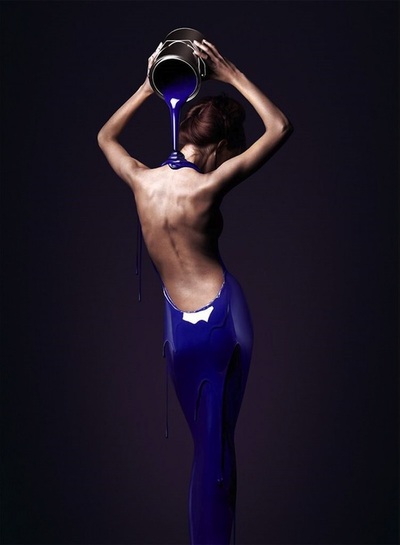
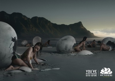
Christophe Gilbert

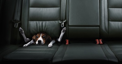
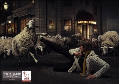
Riccardo Bagnoli 
These artists are both obvious photoshop professionals but more than their artwork just LOOKING incredible I love the concept behind each of their styles. Christophe uses body and color in place of actual objects where Riccardo uses symbolism and metaphors. He takes things that have a bigger meaning and puts them where they dont belong to create intention. 
0 Comments

September 07th, 2014

9/7/2014

0 Comments

 
Picture
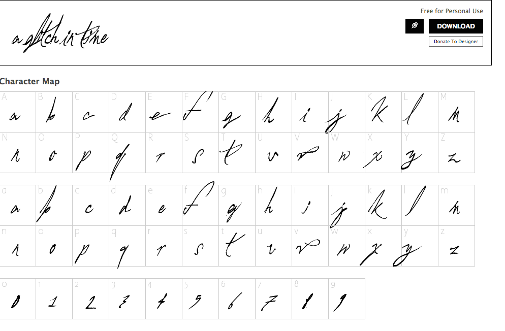
I felt like one of the fonts that best fits my personality is this font here called " a glitch in time" because I do get that feeling when I look at it. I feel like I should take a good look before it blows away, like a handwritten message in a bottle or a the handwriting you would find from your grandmother diary back in 1965. I think this fits me because I like to live in the moment and I like to collect antiques, things that have personality and stories, things that have seen parts of history. That is what this font looks like to me. 
Picture
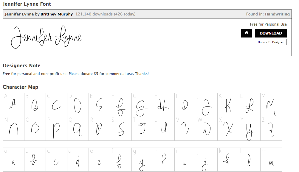
This is the second font I feel like fits my personality because it is simple. I think that I am a pretty simple person with loops here and there, i'm pretty legible and I can be inconsistent like some of the letters, They have a free feel to them and I would say that is very much my lifestyle. 
0 Comments

    Author

    Write something about yourself. No need to be fancy, just an overview.

    Archives

    November 2014
    September 2014

    Categories

    All

    RSS Feed

Powered by Create your own unique website with customizable templates.